Springridge
Background
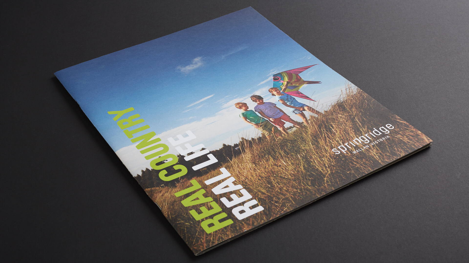
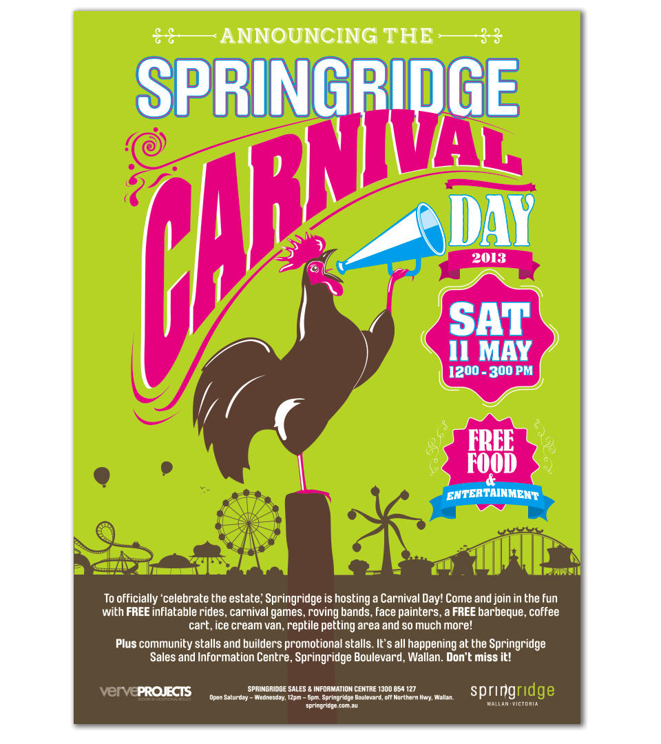
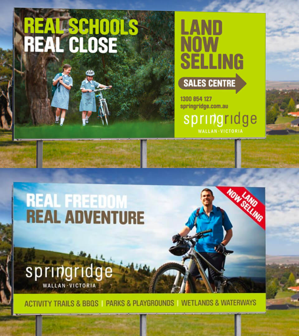
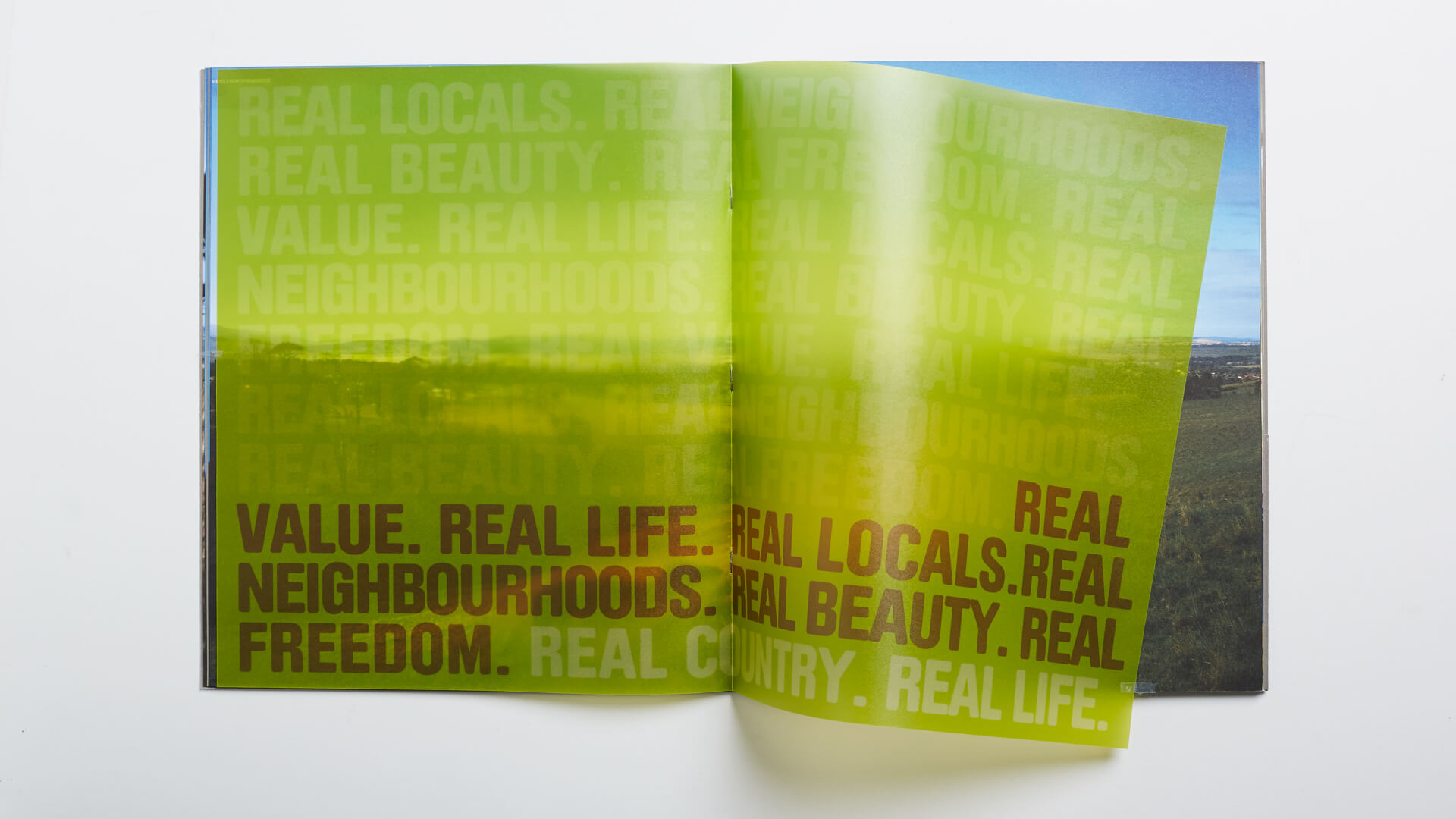
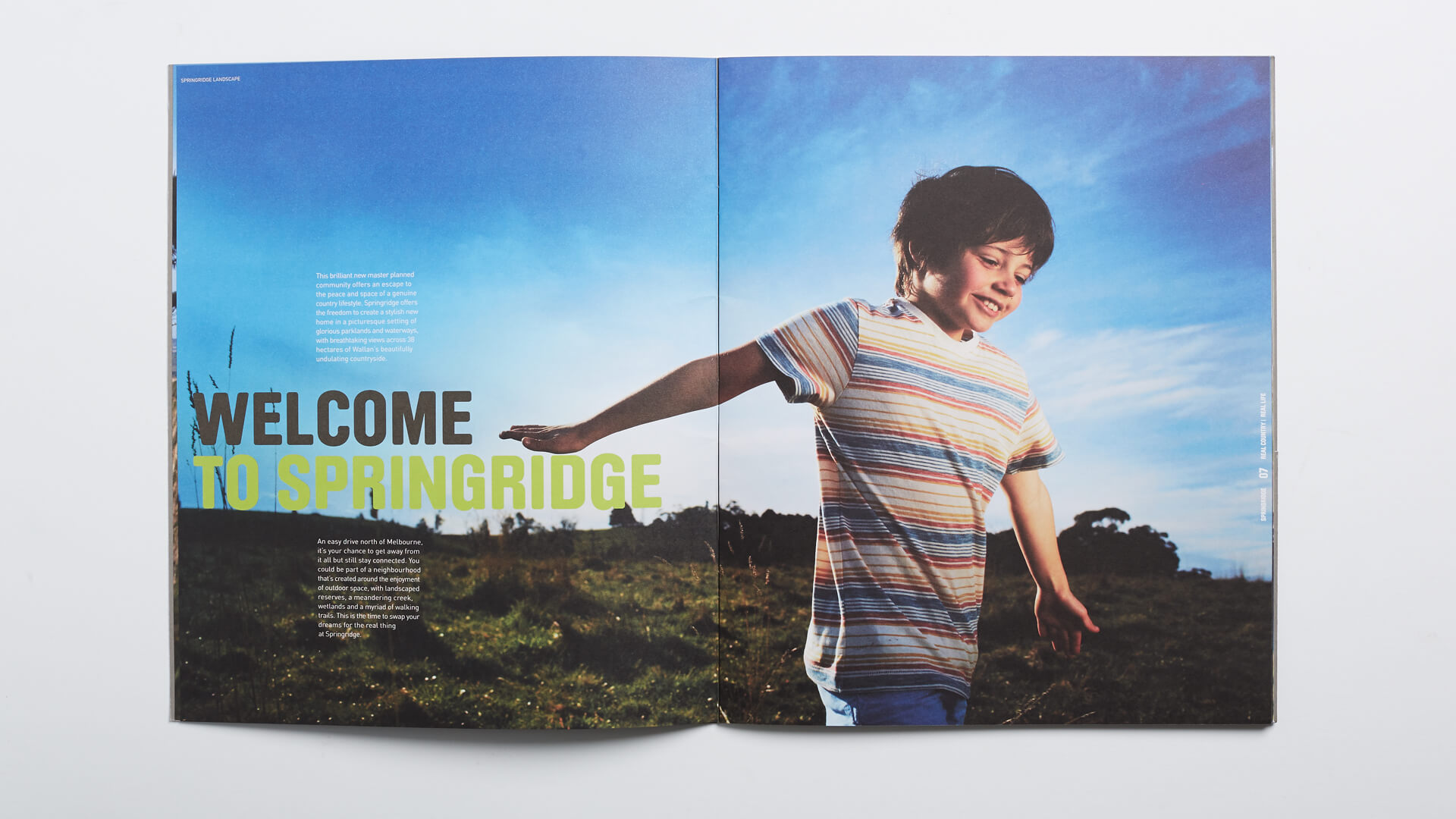
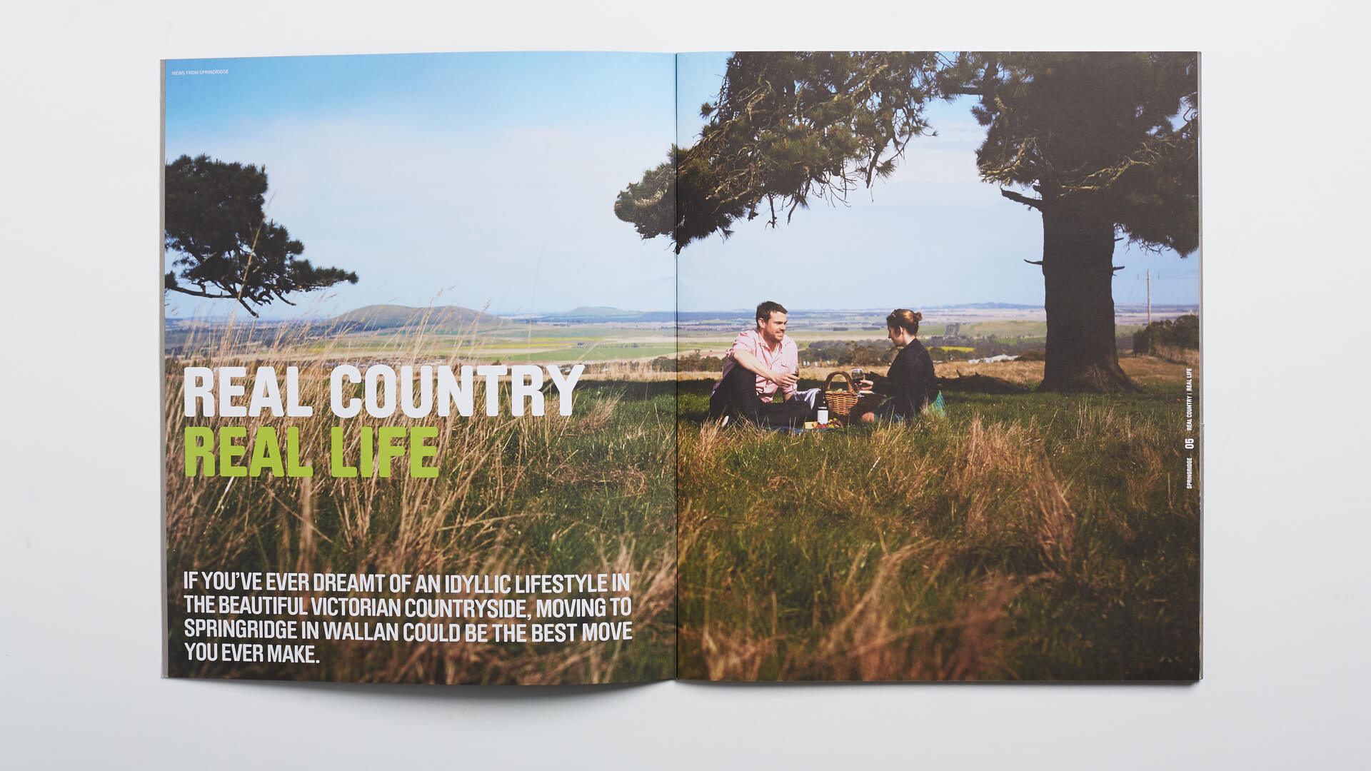
The existing brand identity failed to accurately reflect the brand promise of an intimate neighbourhood with rural charm. The colour palette and stock imagery lacked the authentic feel of a regional town. Above all, the website, advertising and collateral was inconsistent and as a result, did not communicate one clear vision.
Strategy
Having analysed the competitors and property market strategies, we were able to identify the unique selling proposition of the estate. While the competitor estates offered more in terms of internal amenities, we discovered that this ‘fenced in’ community lifestyle did not appeal to all segments. With flat land, linear streets, man made features, the competitors seemed artificial and inward looking in comparison to our undulating hills, natural features and locally engaged community.
