Alberts
Where Now Meets Next
Background
Alberts, Auckland’s new private work space collective and members club, was conceived as a place to create, collaborate, socialise, and enjoy a premium hospitality offering. A response to the global pandemic, has accelerated the urgency for less traditional business environments, in favour of a new fusion of aspirational workspaces, enhanced meeting rooms and a private membership club to accommodate the needs of Auckland SME’s, looking for a one-of-a-kind modern workplace.
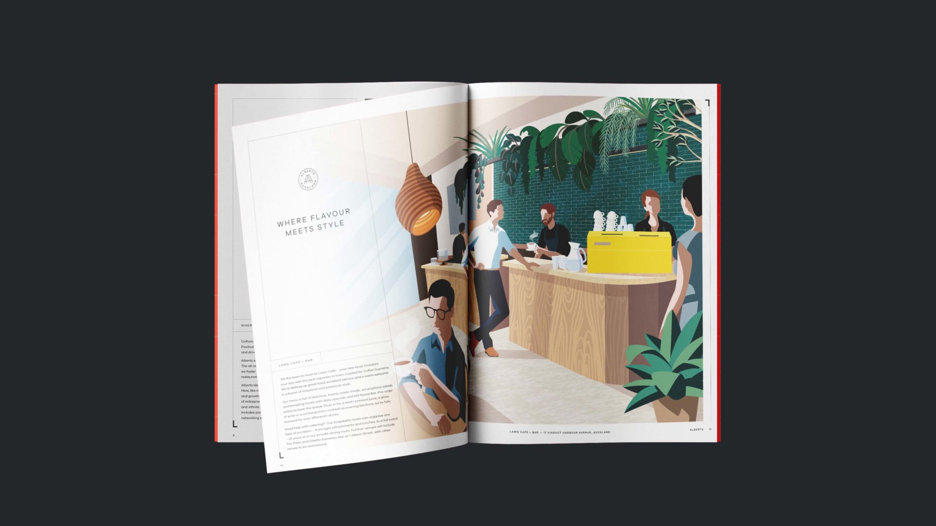
Alberts inspires a community driven environment by combining the private workspace with events, bars and five-star amenities to casually meet and interact with like-minded members. Great work after all, is inherently social!
Approach
Quattro Real Estate engaged Traffic to create the Alberts brand and develop a strategy to position the Alberts at the top end of the ‘new modern workplace’ offering in Asia Pacific.
Our goal was to frame its mission and brand values – Honesty, Innovation, Inspiration and Boldness and reflect these values within its visual identity, brand communications and digital footprint. From the outset, we focused on presenting Alberts as the new home for small to medium and growing enterprises, communicating its ideas, offering and values to the world.
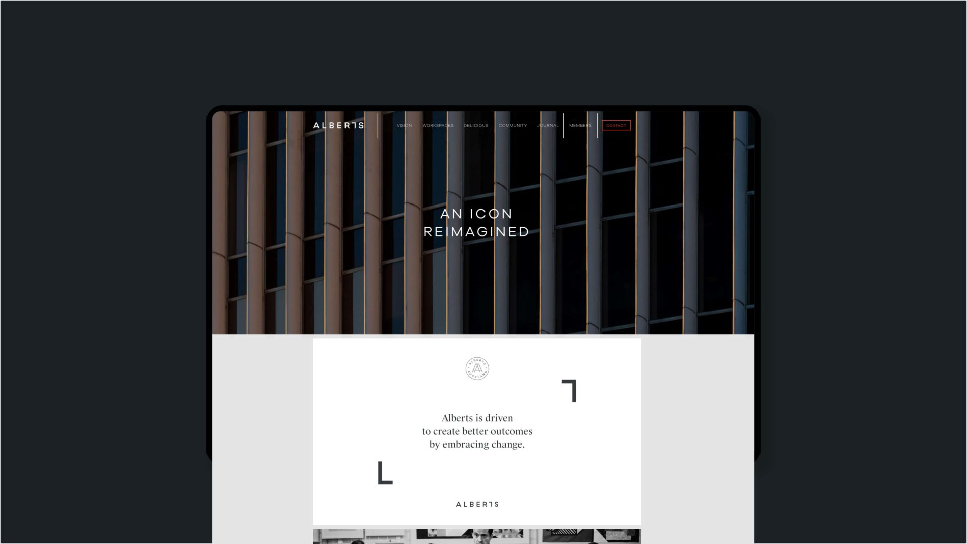
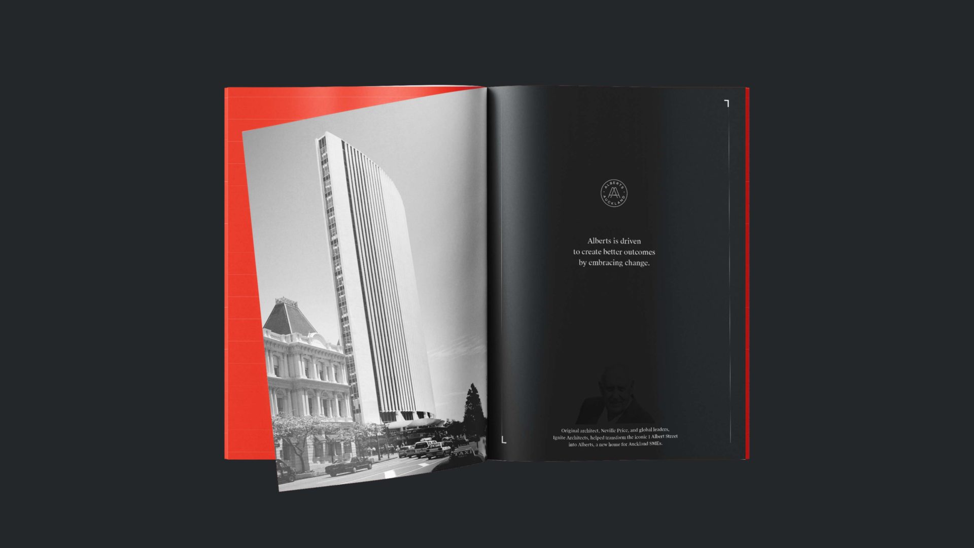
Inspired by both its ethos and the recently modified building architecture found at its flagship building designed in 1972 by ‘Starchitect’ Neville Price – 1 Albert Street, Auckland, we anchored the brand around a bespoke typeface, creating a sense of anticipation and inspiration. We developed the spirit of the identity around Newness and Change. Newness – a place where SME’s are challenging themselves to work in new ways and for the public to see work in a totally different manner to what they expect. And Change – a space where Alberts is driven to create better outcomes by embracing change, giving ambitious businesses the most inspiring environments to engage, succeed and profit.
Solution
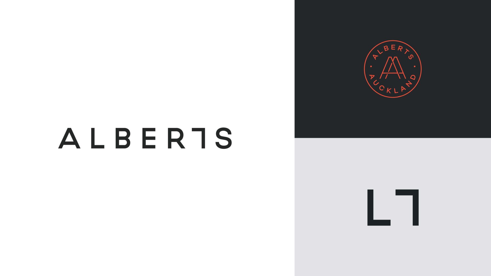
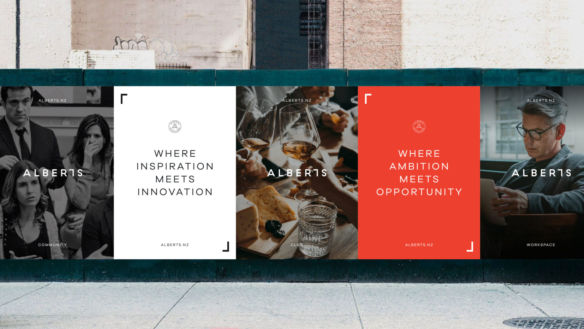
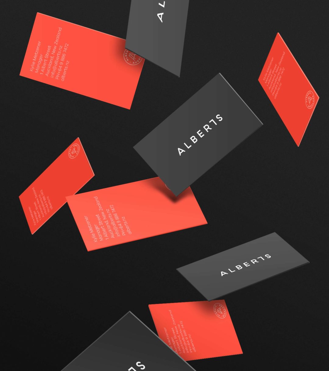
Exploring the idea of past and present we worked on an iconic logo with a bold typeface that has a subtle reference to framing within a space, created for a community of like-minded individuals at Alberts – a place ‘Where ambition meets opportunity.’
We needed to create a brand that reflects the core essence of Alberts, giving ambitious businesses the most inspiring environments to engage, succeed and profit.
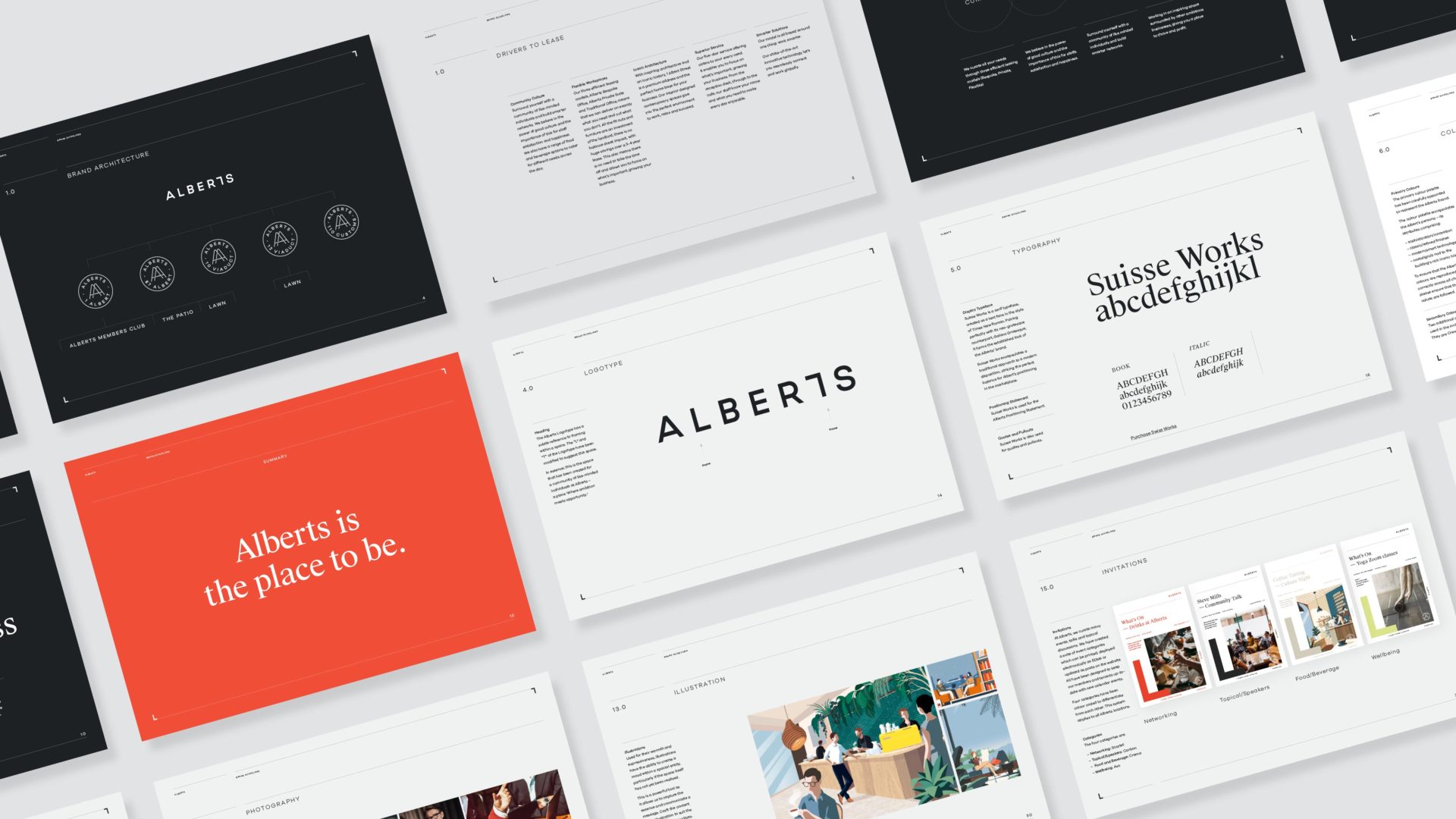
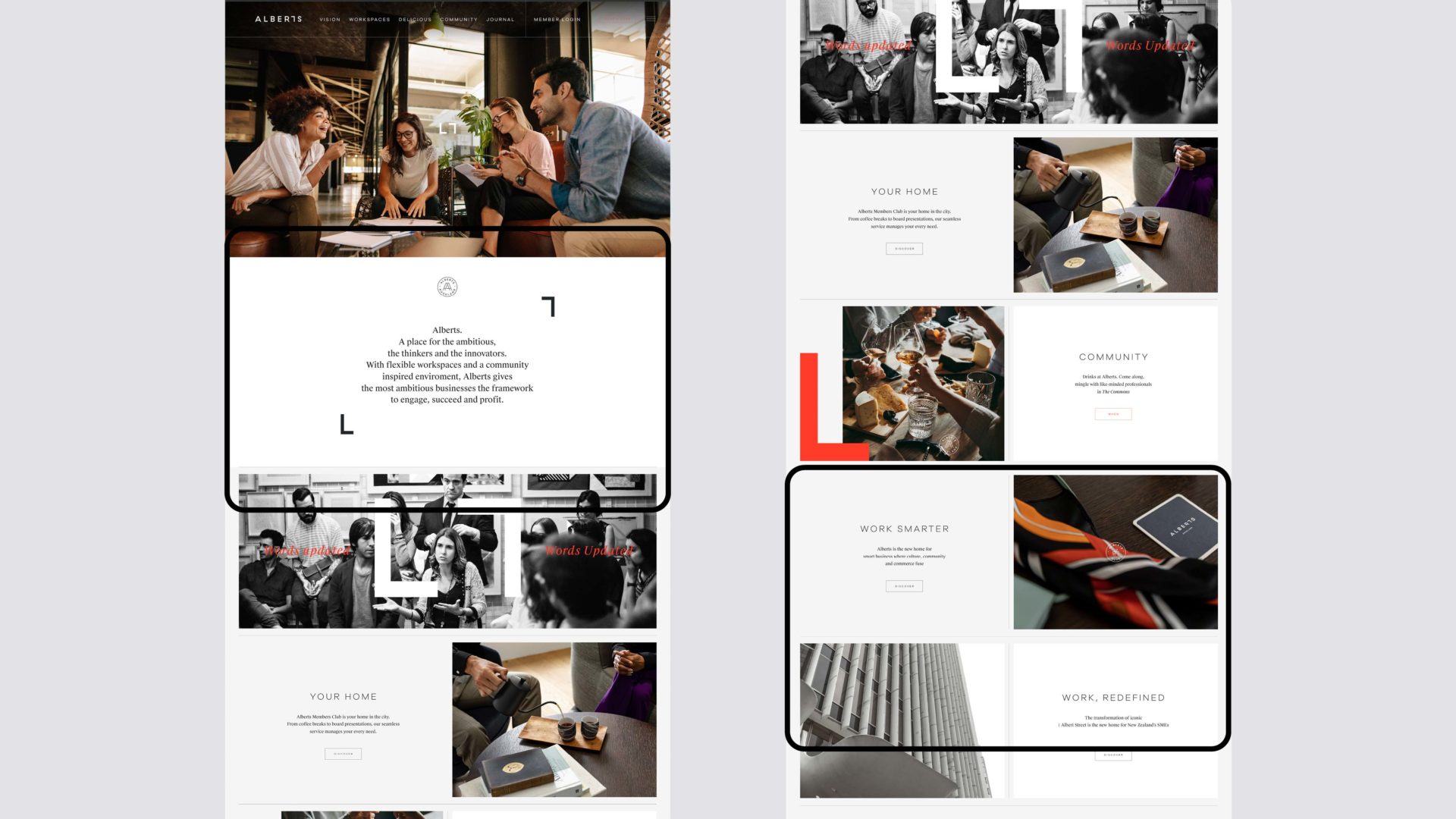
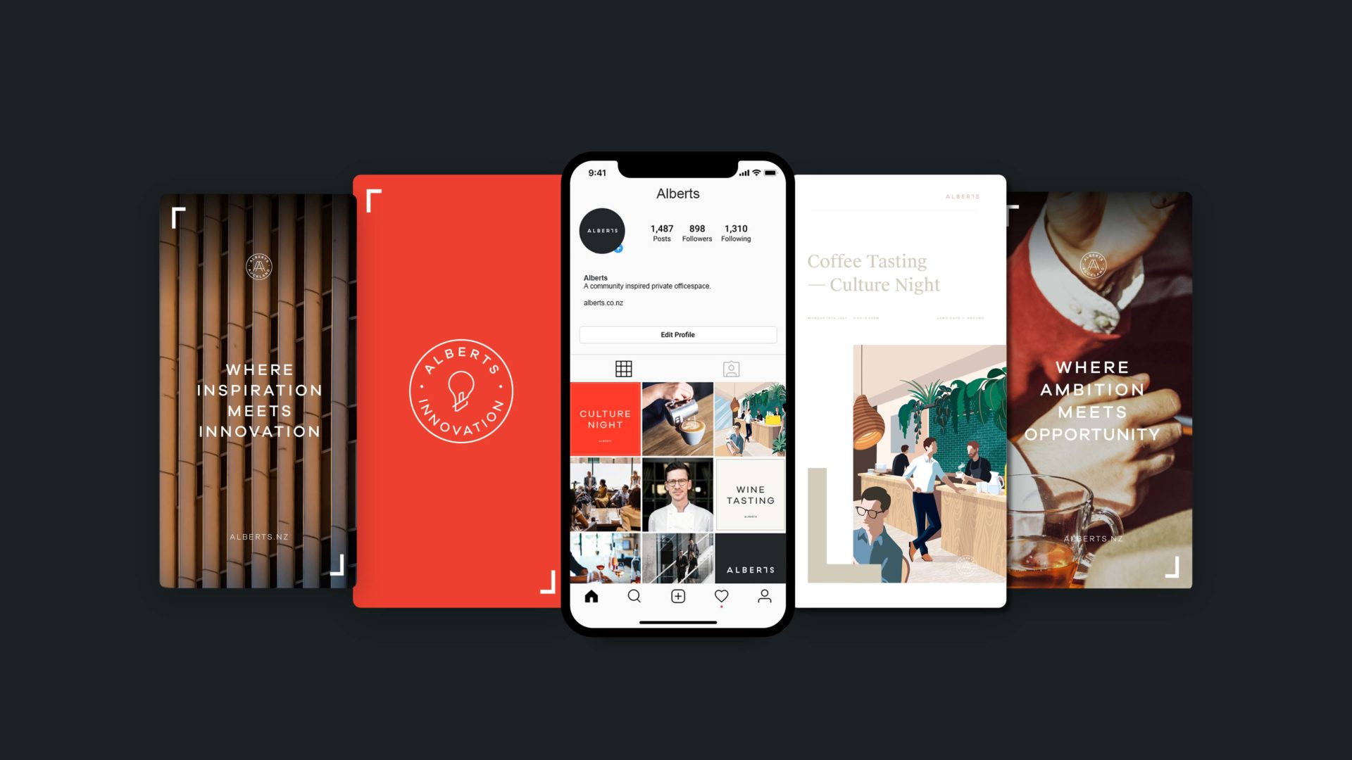
We created a visual system, a recognisable frame device and iconic makers mark. The visual identity is a reference to the building process itself, each component coming together to create a new whole, greater than the sum of its parts. But with Alberts, since the members are paramount, what we really did was create a personality to frame the content that is generated within its walls.
Ultimately, we helped Alberts develop a coherent and unified brand that speaks to people all over the world—giving them the tools to continue to transform the modern workplace well into the future.
