
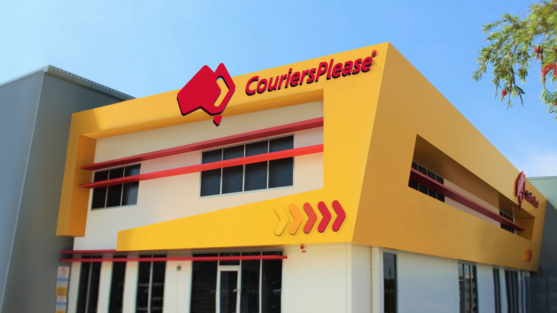
CouriersPlease
Delivering brand synergy
Background
CouriersPlease was lacking a consistent brand look and feel, resulting in adhoc campaigns that had no synergy.
Strategy
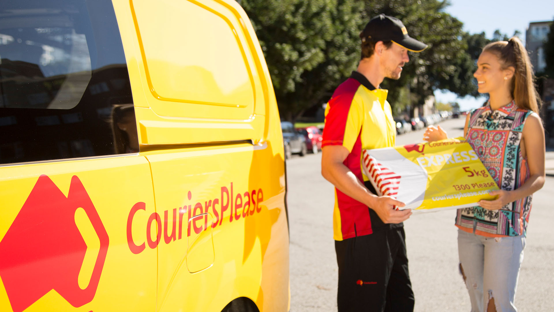
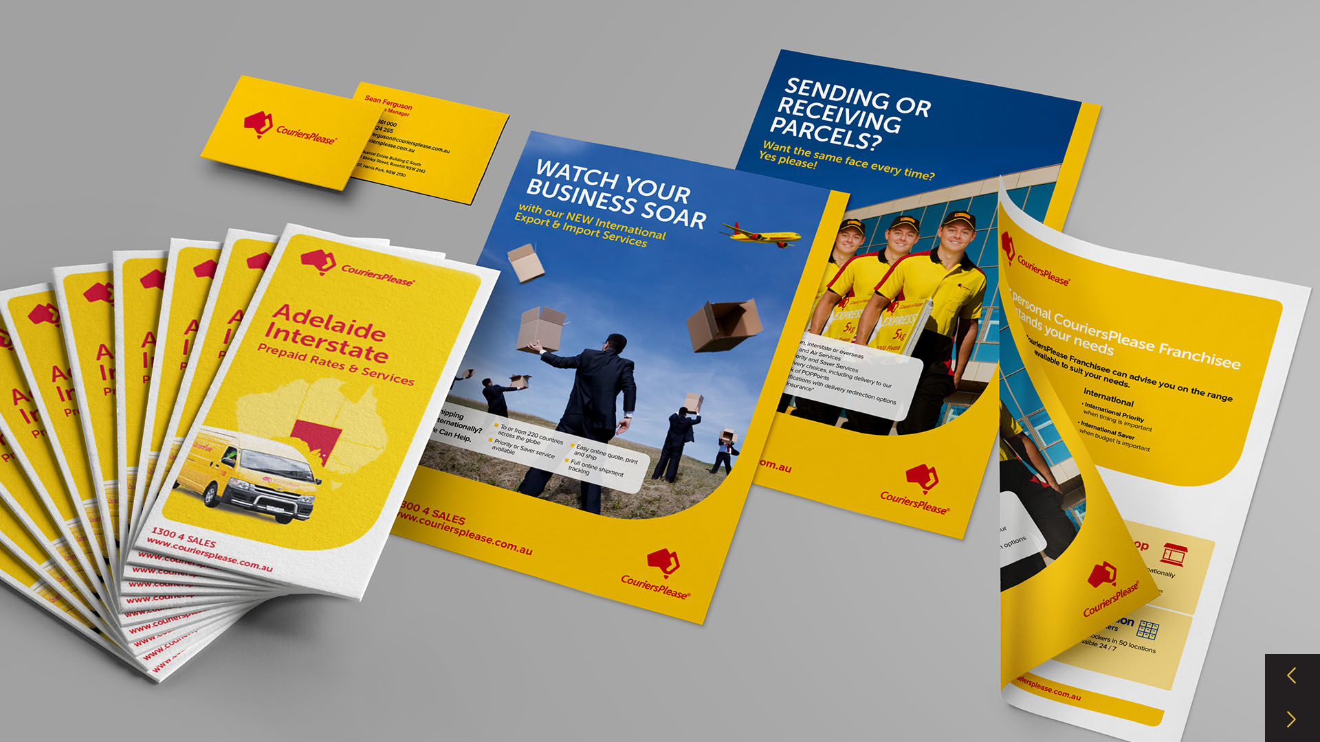
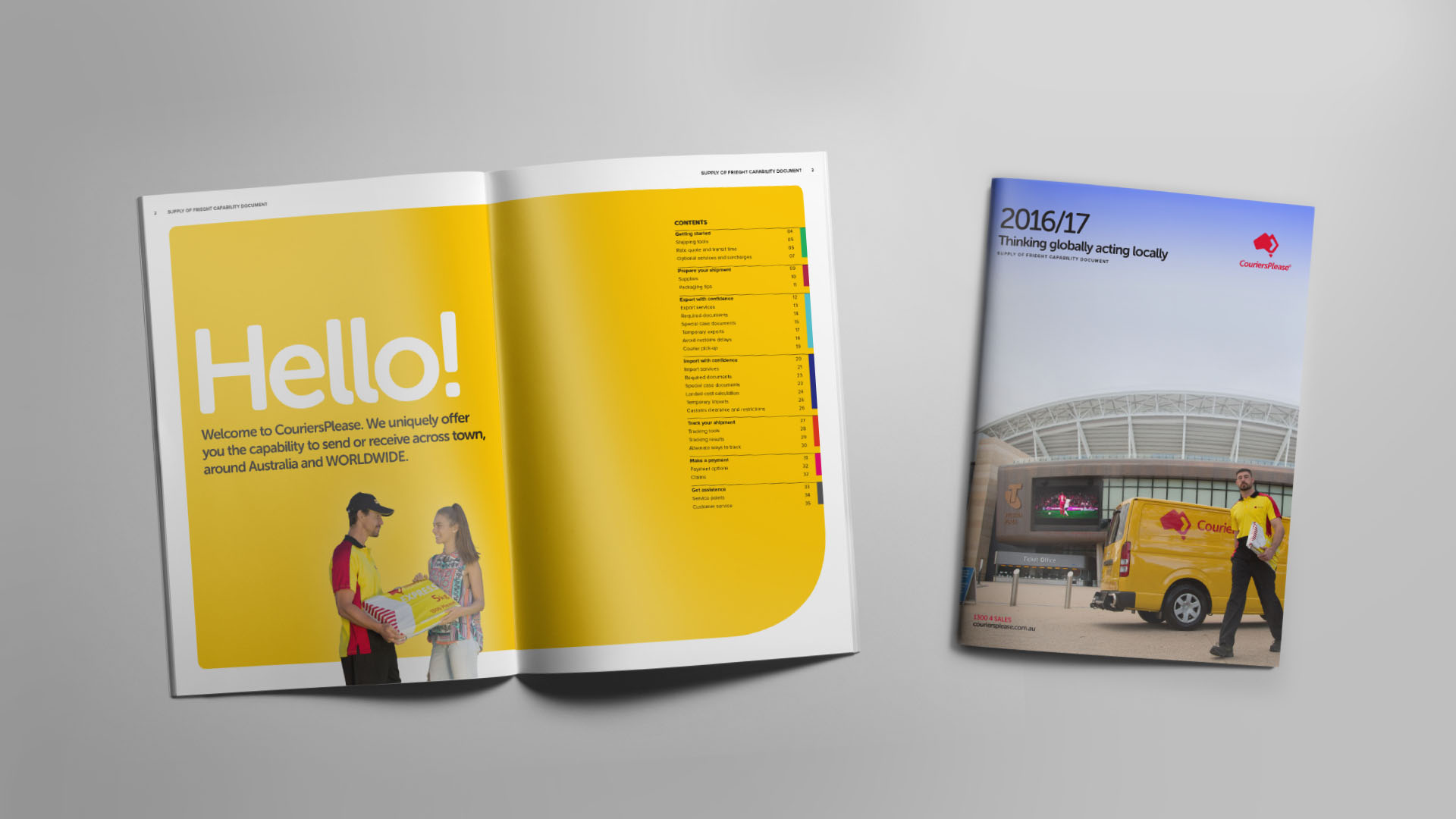
A new visual language was proposed, retaining the hero red and yellow colours.
Solution
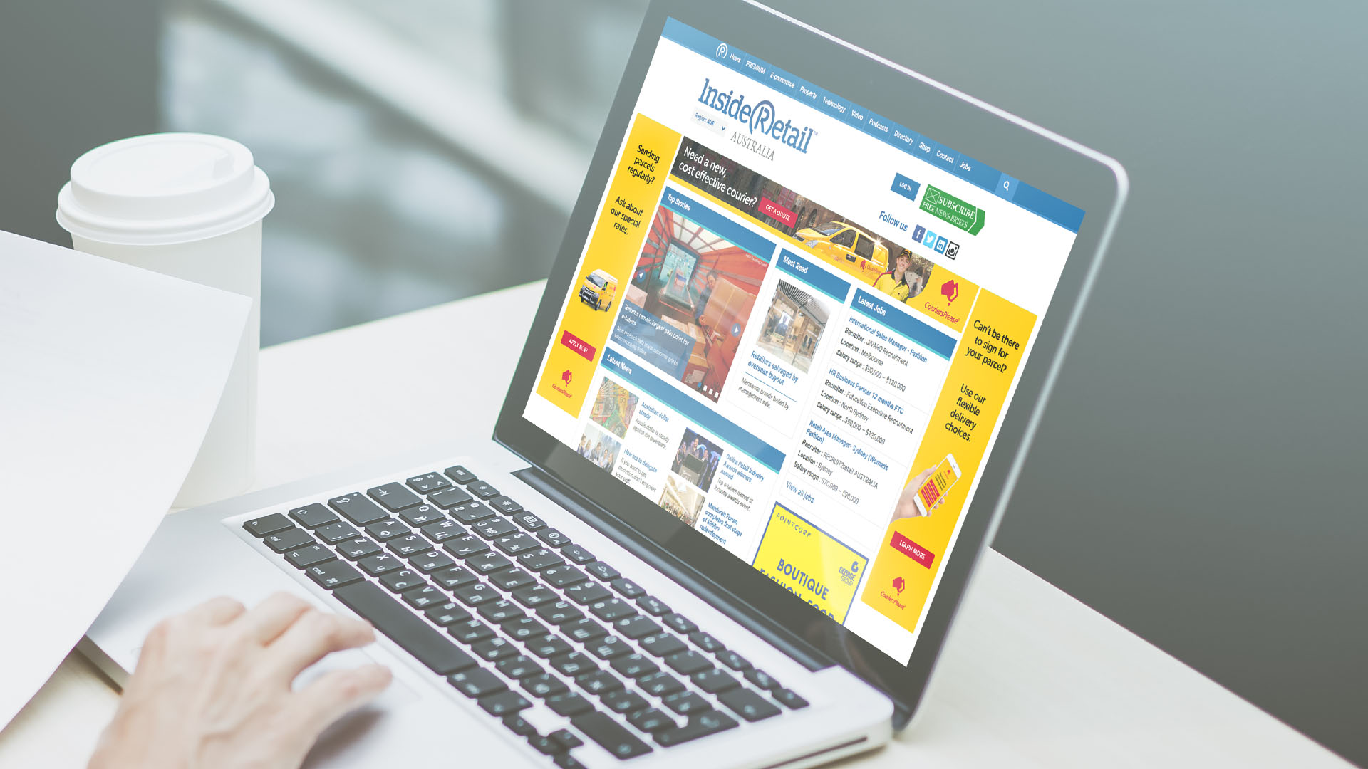
Traffic created a new visual language for the brand, together with a style guide, that saw the new visual treatment applied across everything from business cards, to store fronts, to brochures.

Related Work
Ready to transform your brand?